Filter optimization
The biggest hurdle in buying glasses online is that people can't try it on and it’s not tactile. People are not sure if the glasses they select will fit or look good on their faces. In order to alleviate these pain-points, the following was planned:
Filters (MVP), Style guide, Faceshape guide, Measurement tool/size guide, Virtual try on, and a virtual mirror that allows people to virtually try glasses using device built-in camera
These tools will ultimately be combined to make "My Fit" and be stored to my account for easy retrieval. The first step towards creating the mega tool, “My Fit”, was to improve the functionality and build a more robust filter options. Filters on category pages enables people to narrow down their search from 2000+ frames down to the ones that are relevant and meaningful.
Process

Current state assessment & analysis
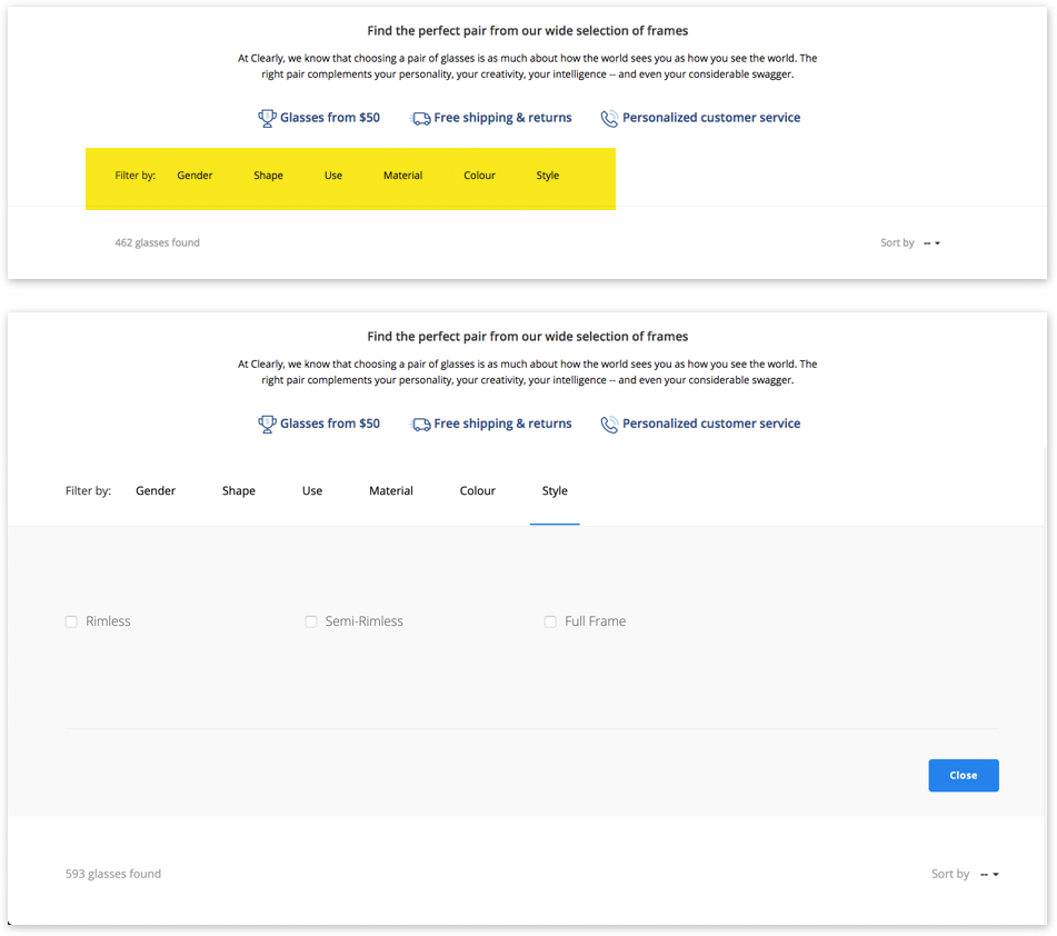
Large screen
Many filters list items are grayed out because of inventory issues causing confusion generate false hope.
Based on demand, people are interested in certain brands like Ray-ban or Oakleys but there is no easy way to shop by brands unless use brand tab on the main navigation.
With all the value props and SEO text along with category banner, filter options are pushed down to the middle of the page. When the filter is open, the UI pushes glasses tiles down further, beyond the fold.
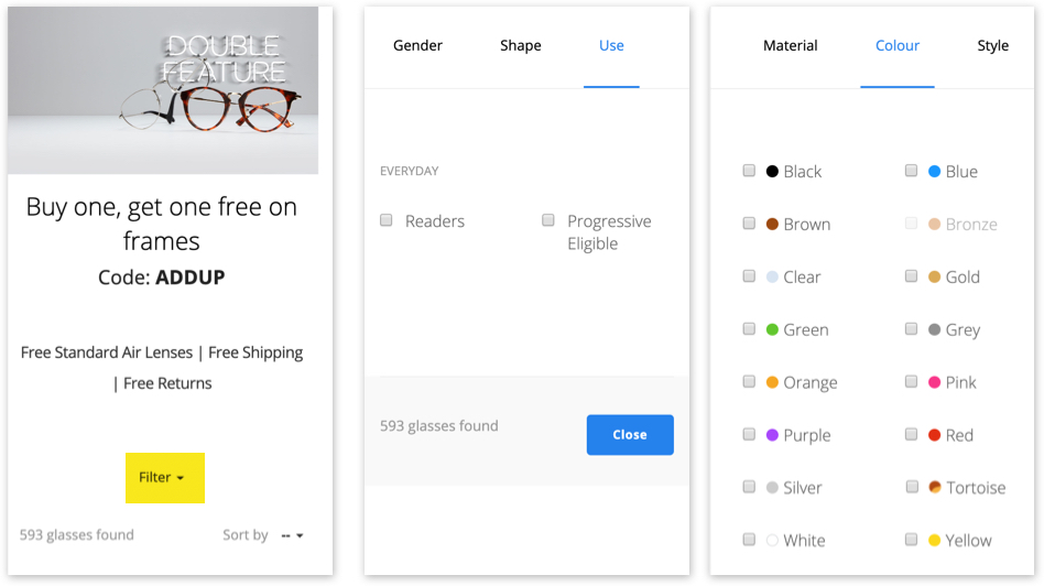
Mobile screen
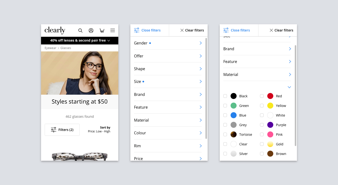
filter is buried under piles of text and images above, making difficult to locate.
filter takes over the whole screen even though most of the filter tabs do not fill up the whole page.
filter tab is hidden under horizontal scroll which is often not used because people just don’t know the existence of more filter options.
close button is jumping around between filter tabs - lack of consistency.
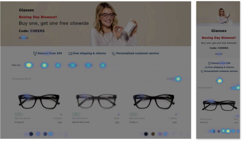
Based on heatmap taken from Dec 22, 2017 heatmaps, 10,000 pageviews most used filter tab is Gender (5%), Shape (3%), Material/Colour/Style (2%).
According to Adobe analytics, people who use filters to narrow down their searches is 24% more likely to checkout.
User sentiments
Call center + NPS + Internal interview
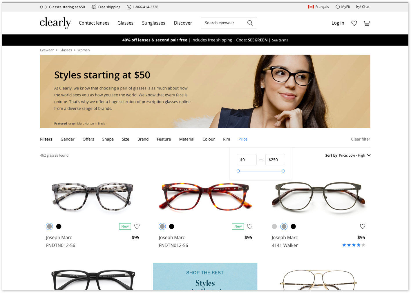
Filter based on price: You used to have filters by price. I don’t see it anymore.
Features: I want to buy glasses with sun clips (add-ons).
Do you have lightweight frames? I have really thick lenses so I need light frame or else it presses my nose.
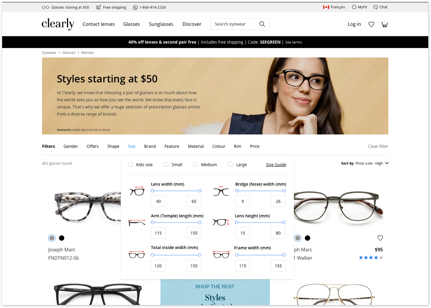
Fit: I want to see only the frames that will fit my face
I don’t know what my size is.
How do I measure my glasses?
How do I know if this will look good on my face?
I don’t want to return my glasses because it doesn’t fit.
Terminology: Wordings don’t make sense. I have a hard time understanding what each category means and I work here.(internal interview)
Customers who buy glasses online are insecure about fit, look and feel of their glasses as well as price. These factors discourage people from purchasing glasses online - where the selection and price might be more desirable.
When customers shop online, they are often overwhelmed by the number of selections and pages to go through to find the right frame.
Problem definition
Clearly does not provide ways to easily narrow down the glasses selection to alleviate the price, fit and look & feel concerns of online glasses shoppers.
Goal
Design a system that allows online glasses shoppers to narrow down selections to the most relevant products that will address fit, look & feel and price concerns.
Design Principle
Be simple and easy (take the cognitive load off of people. They already have a lot on their mind!)
It is an iterative process - let this be the start of the next great product.
Requirement gathering
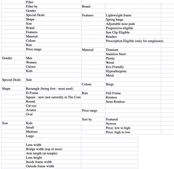
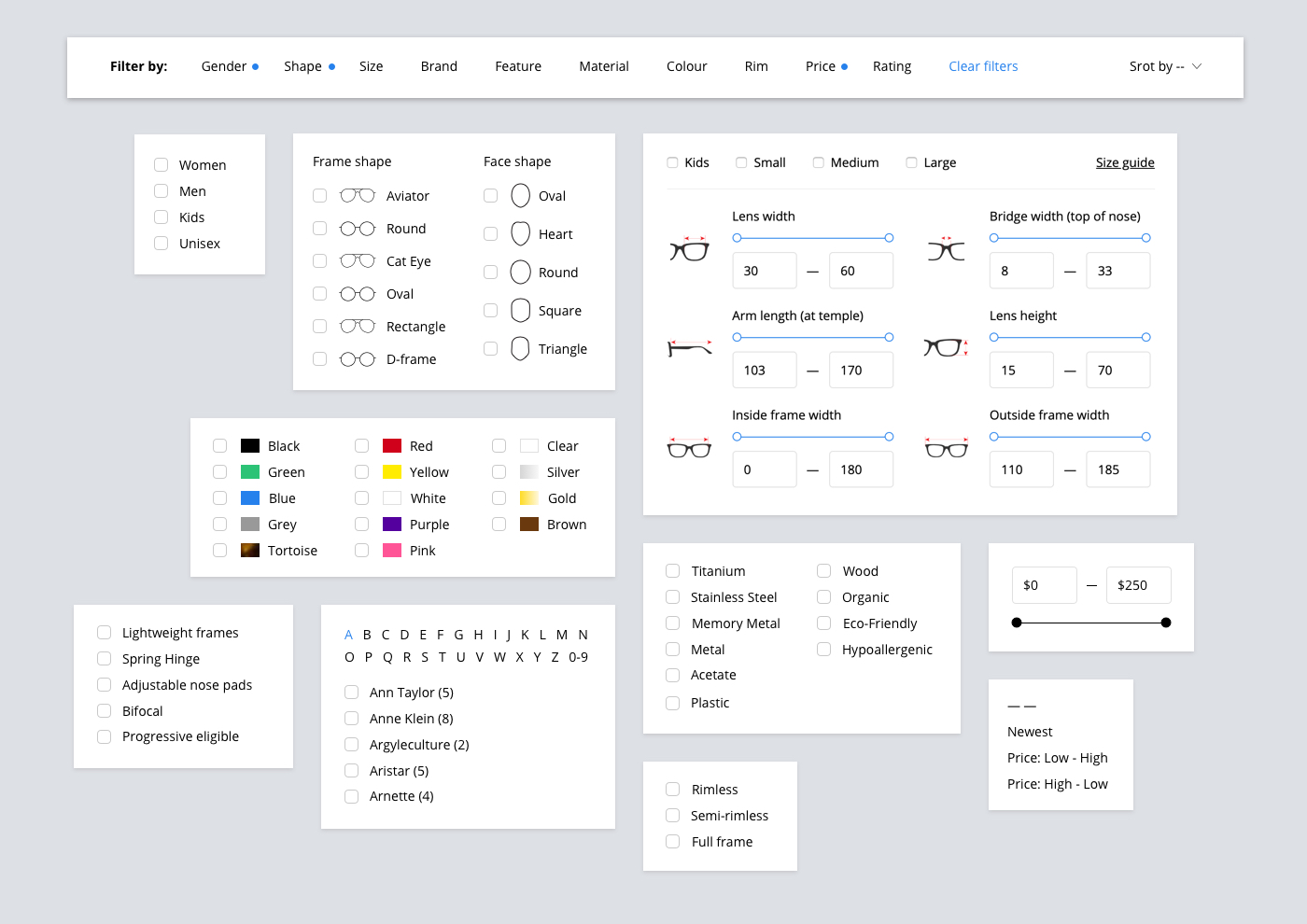
Filter categories and list items were selected based on historical data (engagement) before the launch of Clearly’s glasses site of 2016 as well as recent data.
Category names were reworded to be more comprehensive and familiar.
Requirements were written in collaboration with BA, data analyst and merchandising manager.
Design and prototype
Next steps
The next step would be to analyze the performance of the new filter after the launch by setting up heatmaps, recordings, and analytics dashboard. Key performance measured are engagement, next page view, add to cart, and checkout completion.
User survey (possibly include it in confirmation email) of the customers’ experience of the “discovery phase” to understand how they used the filter (if they did, and if they didn’t understand why) and to see what other user pain points there might be.
The next phase of “fit project” would be to incorporate style guide to the “filter experience”.